node_modules), so you keep full control over styling and behavior.
When shadcn/ui is a good fit
- You need reusable UI primitives across sidebar, popup, and options surfaces.
- You already use React + Tailwind in product code.
- You want source-owned components that your team can fully customize.
shadcn/ui capabilities
| Capability | What it gives you |
|---|---|
| Source-owned UI components | Keep generated components/ui/* files versioned in your project |
| React + Tailwind alignment | Use the same authoring model as modern web app stacks |
| Extension-surface reuse | Share component primitives across sidebar, popup, and options pages |
| Gradual adoption | Start from a template, then scale component coverage over time |
Template examples
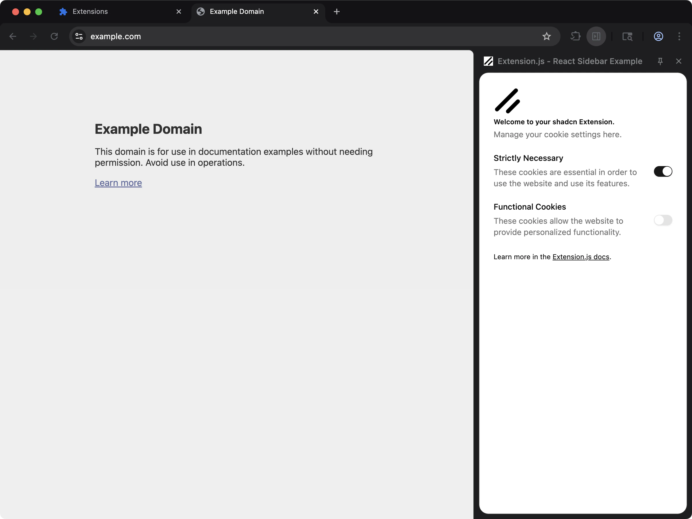
Sidebar + shadcn/ui template
Use thesidebar-shadcn template as the default starting point:
Stack assumptions
- React + TypeScript
- Tailwind CSS
- PostCSS (
@tailwindcss/postcss) - Local
components/ui/*component files (shadcn-style structure)
Manual setup in an existing project
- Set up Tailwind and PostCSS (see Tailwind CSS).
- Initialize shadcn in your project and generate components.
- Keep generated UI components inside your extension source (for example,
src/components/ui/). - Import your Tailwind stylesheet in the extension entry where UI renders.
PostCSS example (Tailwind v4)
Example components.json
Usage
Use generated components from local imports:Content script notes
- Extension pages (popup/options/sidebar/new tab) are the easiest place to start with shadcn/ui.
- For content scripts, import your style entry in the content-script entrypoint.
- Extension.js emits content-script styles through its CSS pipeline, and they can still conflict with host page styles.
Best practices
- Treat shadcn/ui as source-owned components, not a runtime UI package import.
- Keep Tailwind config/content paths aligned with your extension folders (
pages,scripts,src). - Start with one surface (like sidebar or popup) before adding content-script rendering complexity.
- Keep shared tokens and utility helpers in dedicated files (
lib/utils, design tokens, theme variables).
Next steps
- Set up Tailwind CSS if you have not already.
- Add linting and formatting with ESLint and Prettier.